The research
To kick off the design process, I created a moodboard using Pinterest, gathering all the visual inspirations that resonated with my concept. Bringing everything together in one place helped me stay focused and provided a clear direction for ideas. The objective for this packaging range was to maintain a style consistent with the synergy packaging, while introducing a touch more vibrancy and playfulness. I chose to give the illustrations a more prominent role, as each product in this collection features a single plant or fruit. I wanted this to be immediately clear and visually obvious the moment someone picks up the packaging.
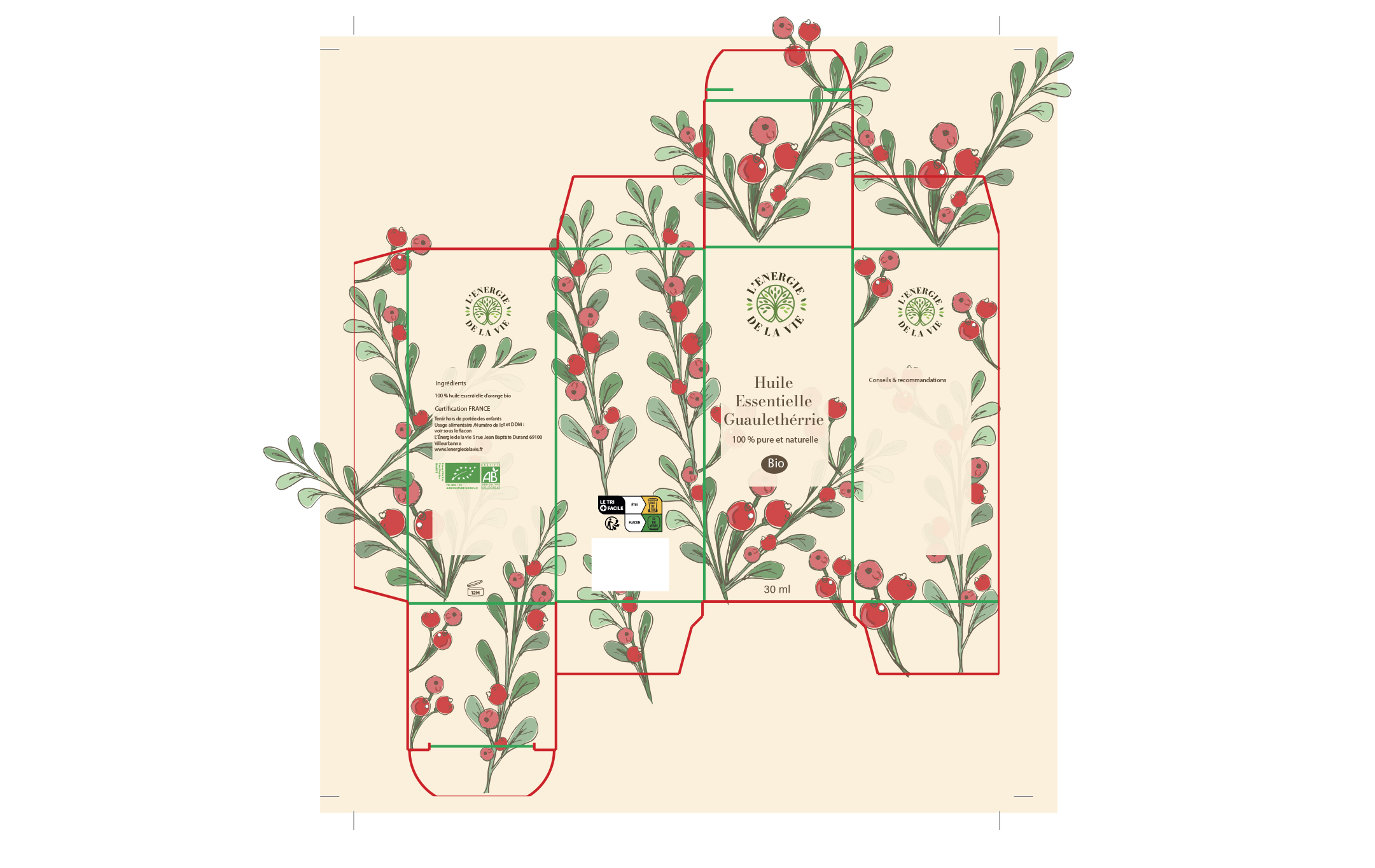
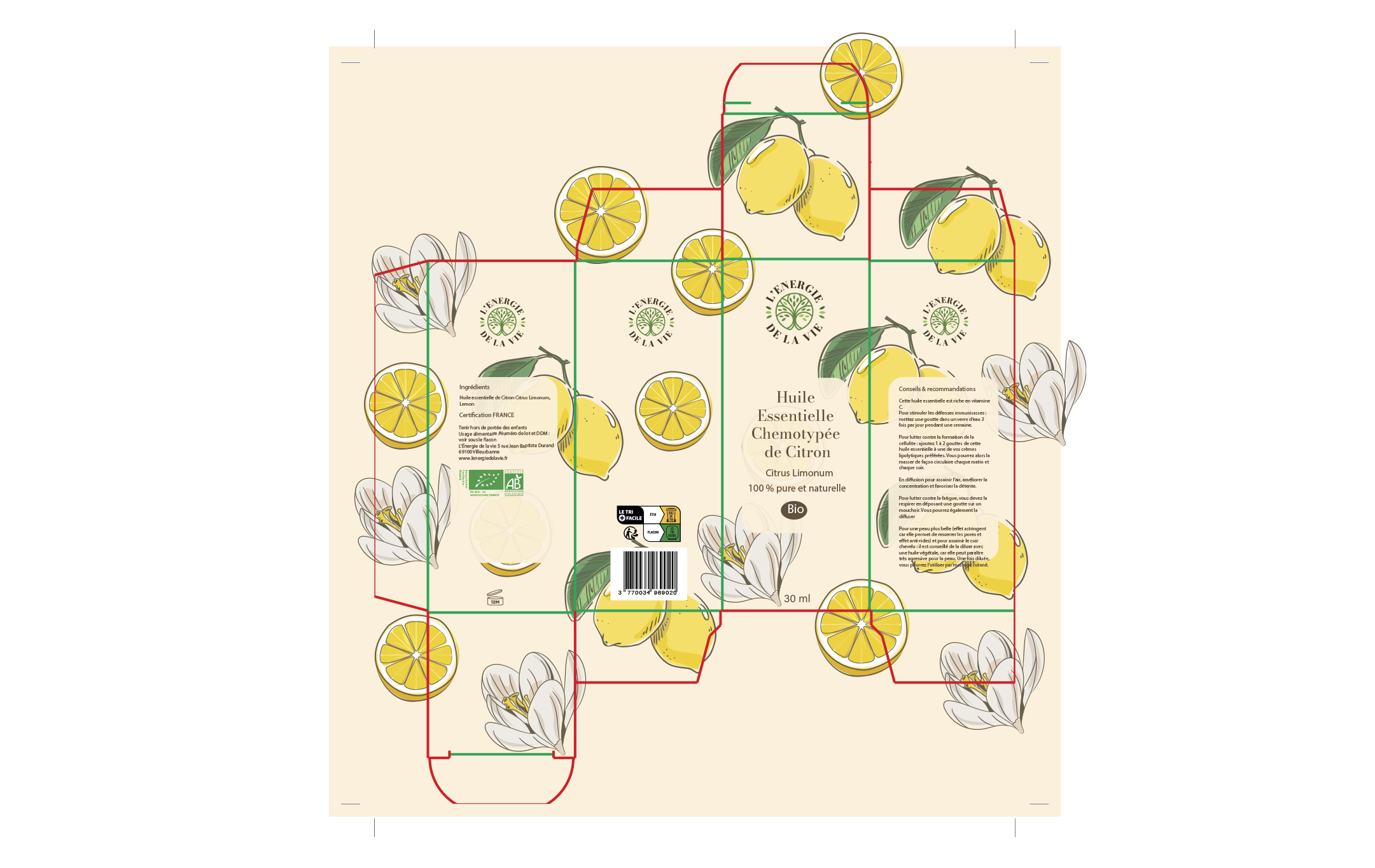
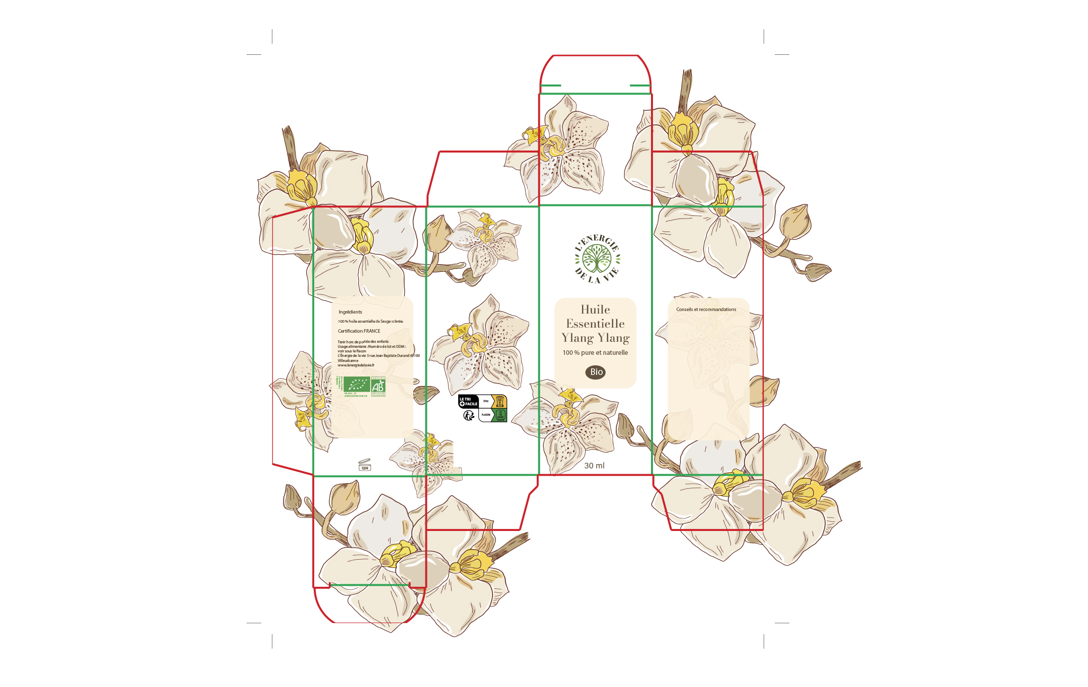
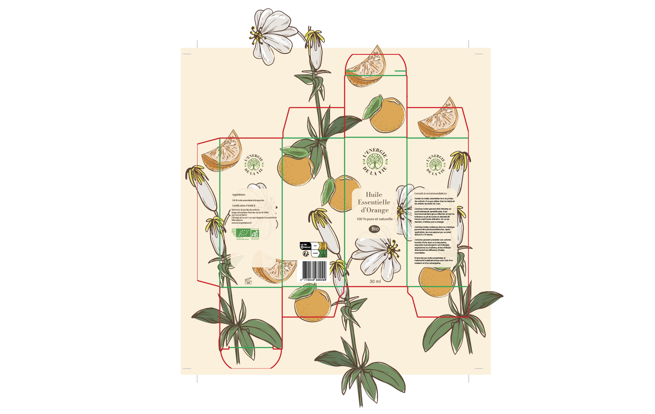
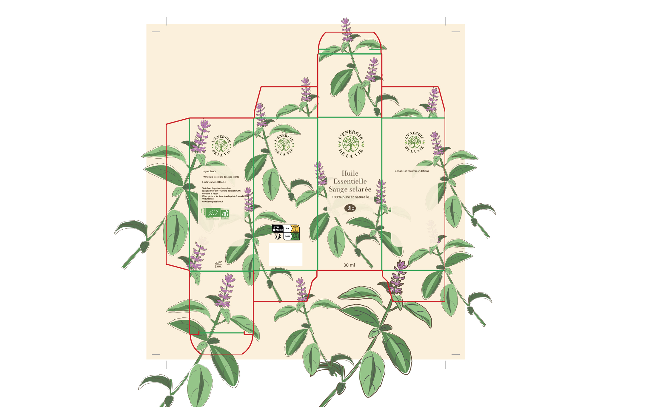
The illustrations
With the help of procreate and illustrator, I would sketch my plants/ flowers/ fruits on paper photograph the sketches and retrace them using procreate on my iPad. The outline of every plant flower or fruit is dark brown and pretty much the same width.
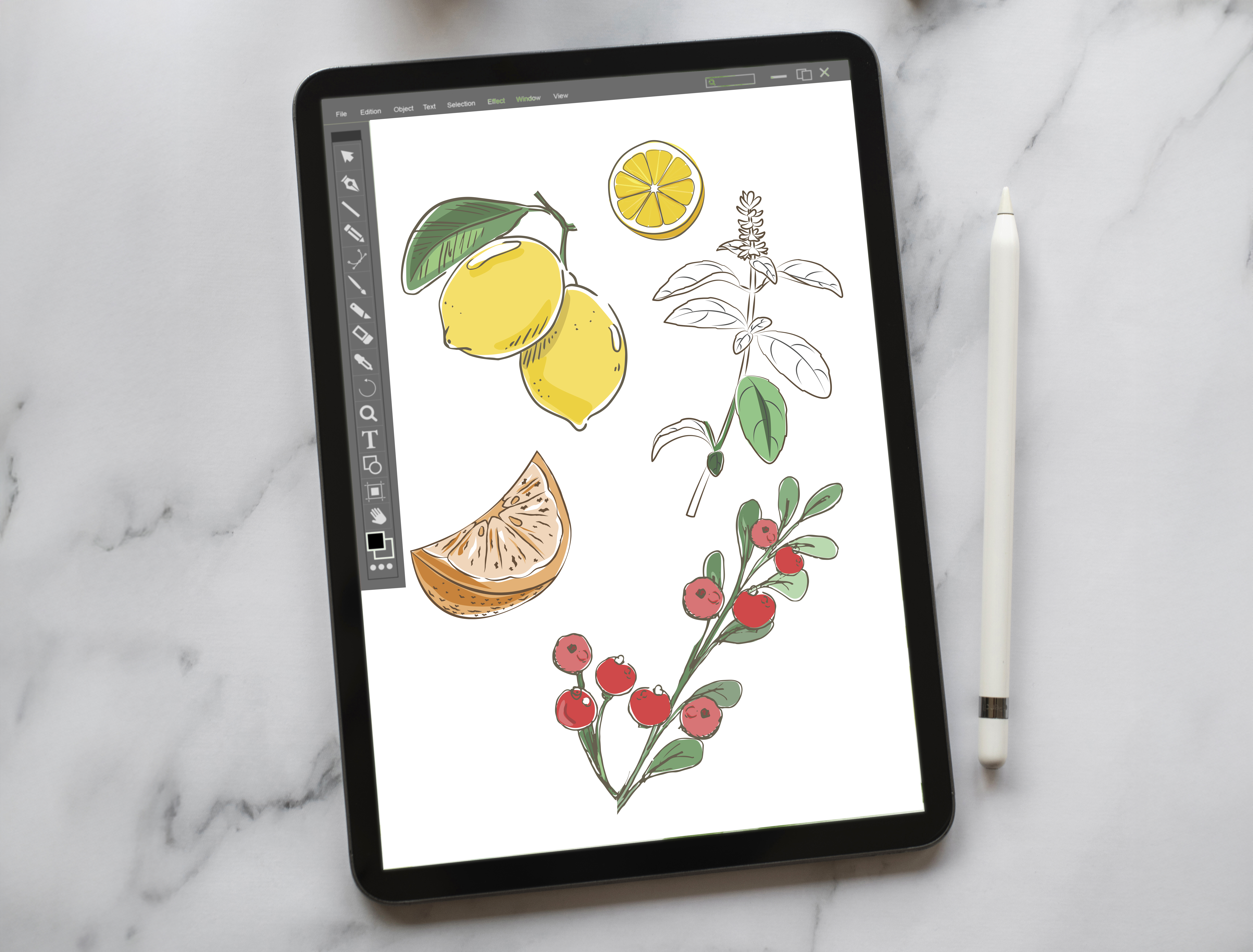
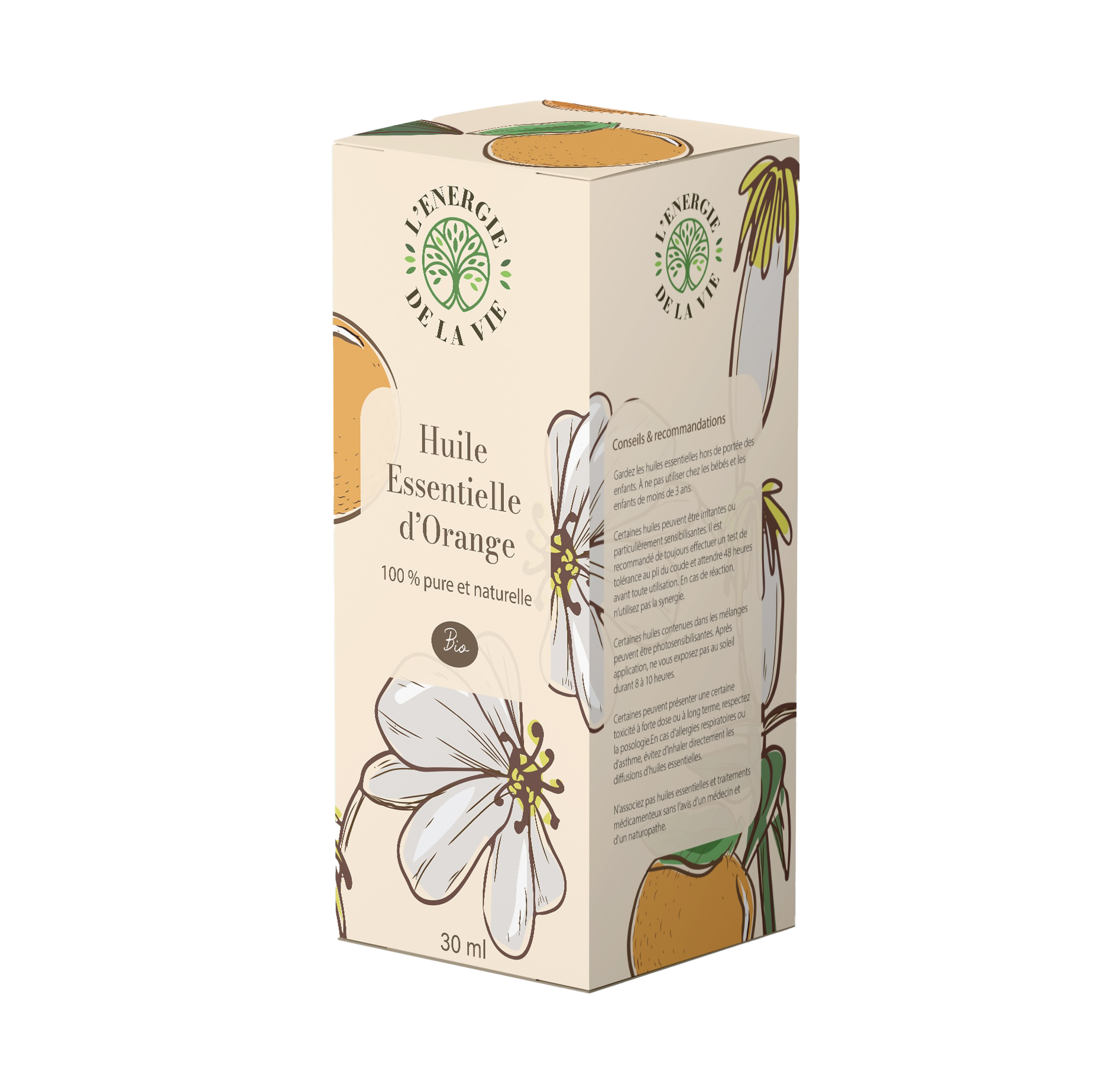
Orange
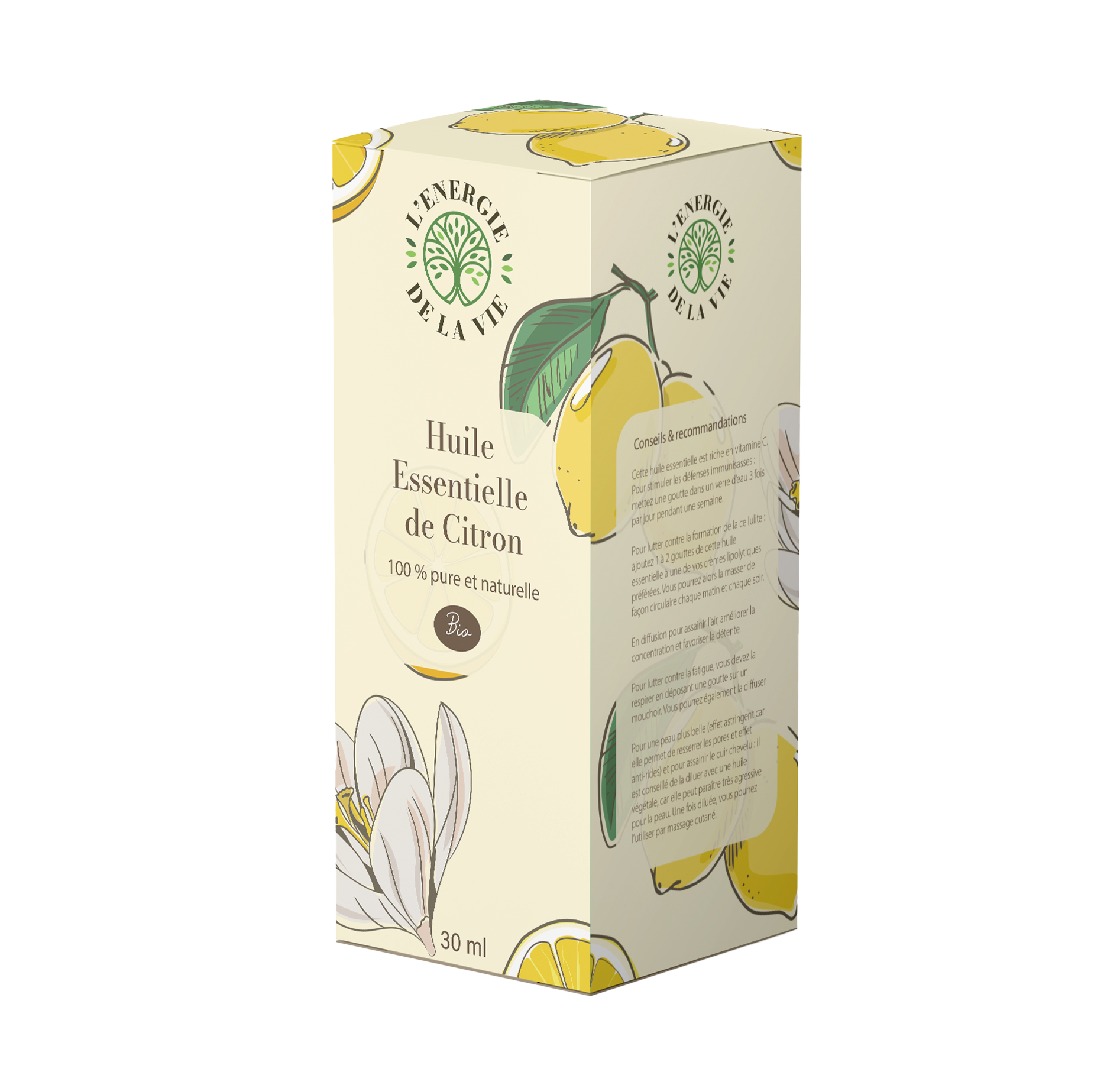
lemon
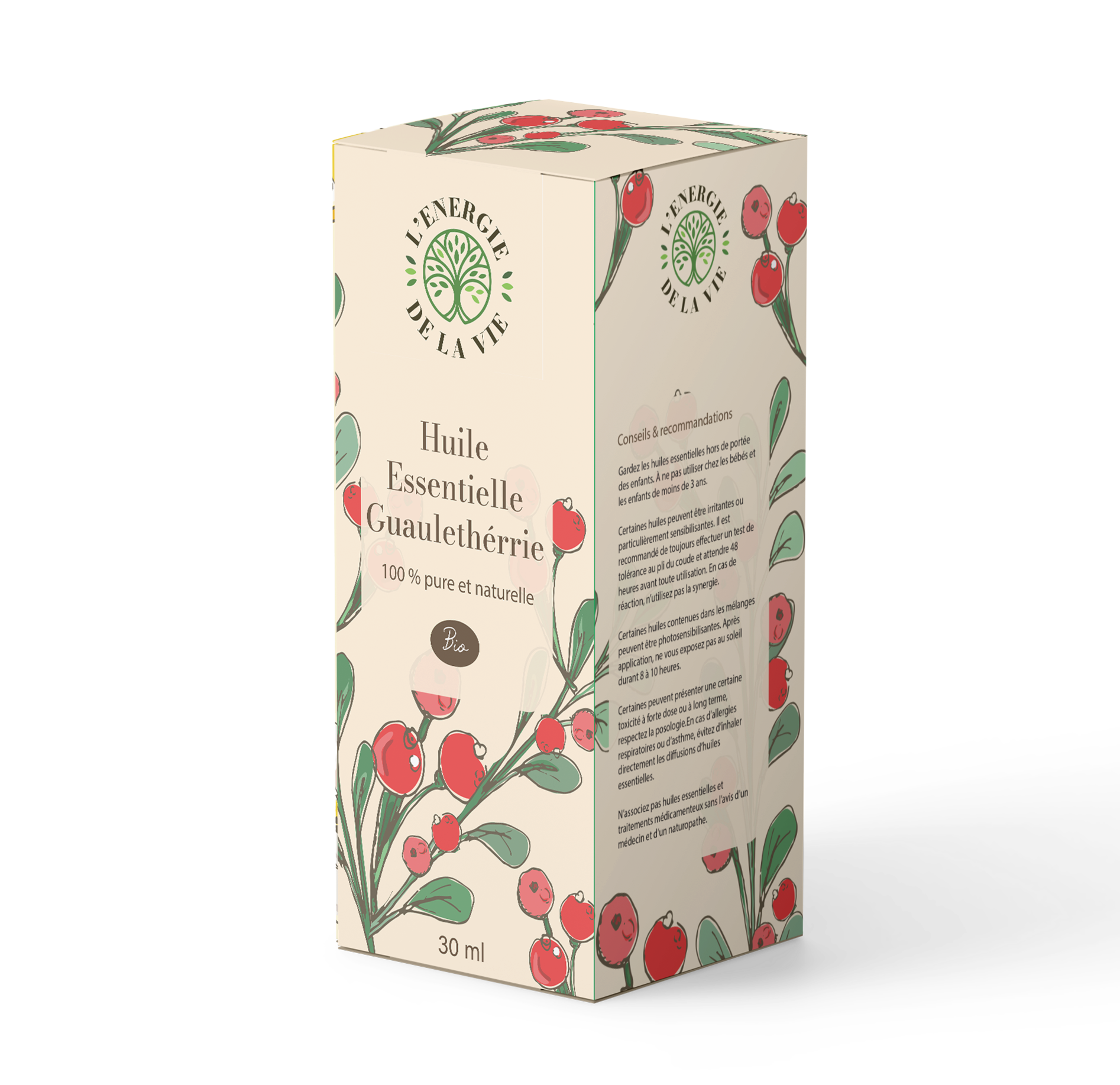
GUAULETHÉRIE
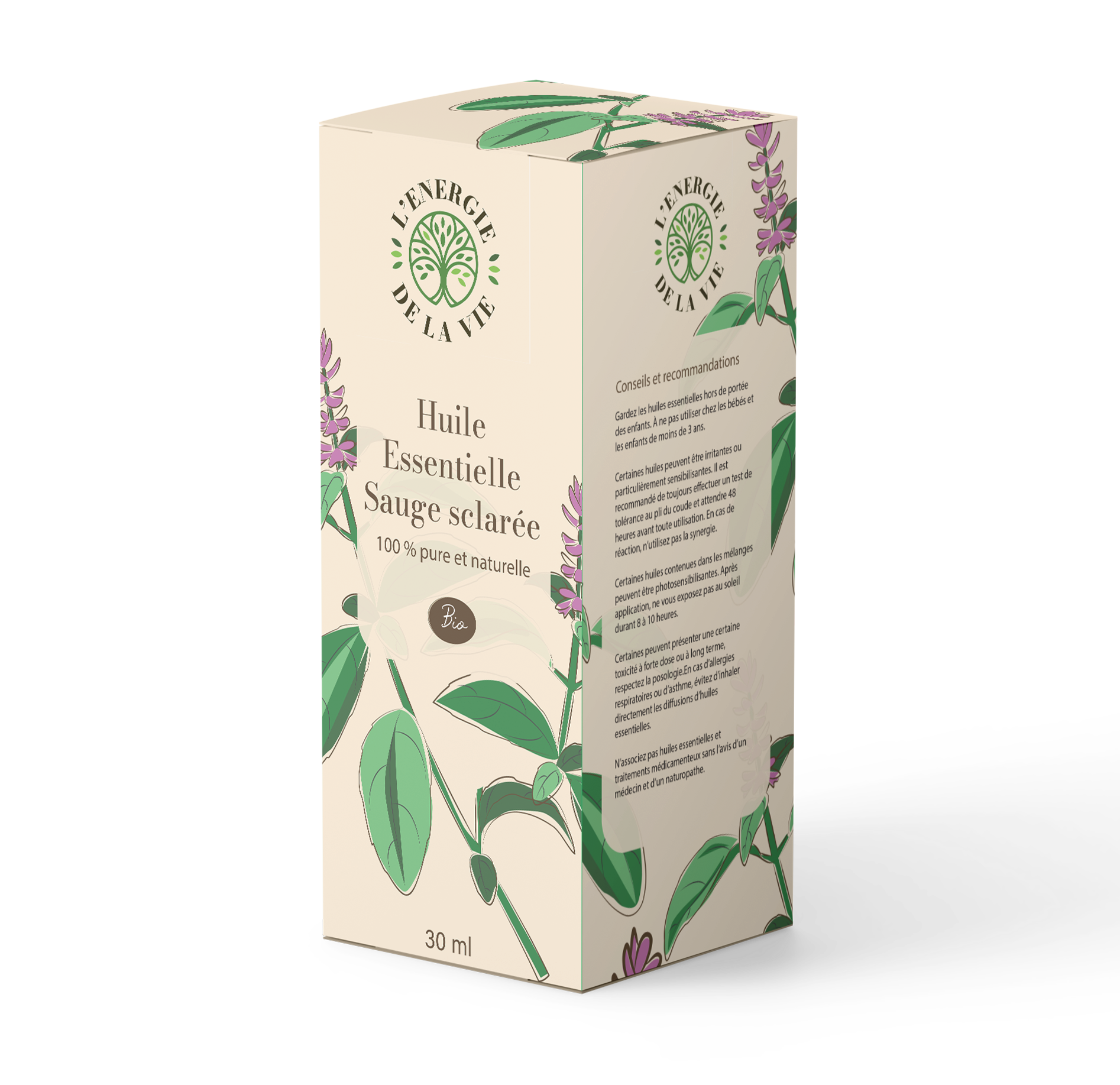
SAGE

SOFT MINT
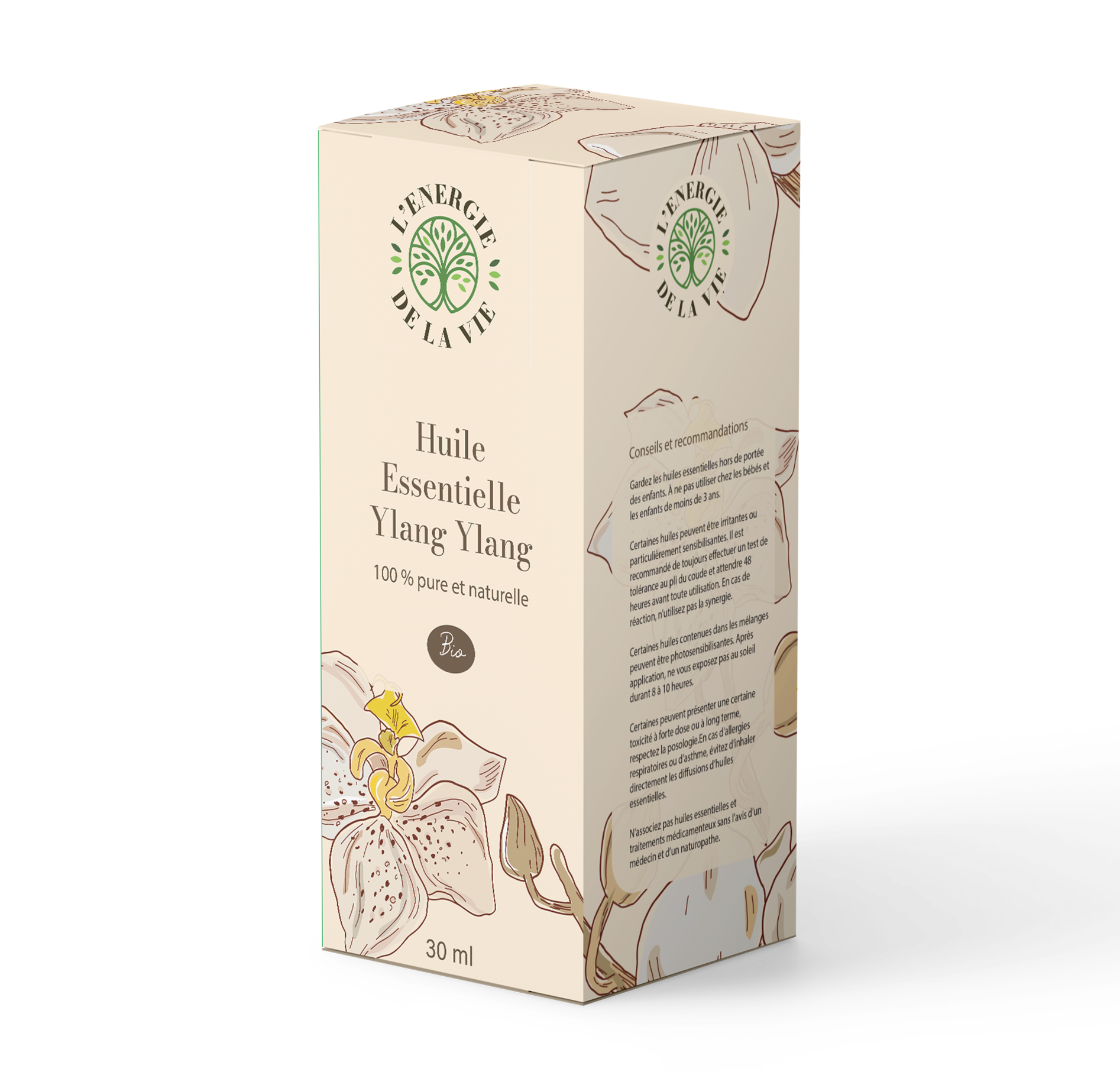
YLANG YLANG